Pantone Color Institute’s 2019 Color of the Year…
Posted December 20, 2018 in Blog
 As the dark days of December fall upon us and we are just hovering over the shortest day of the year, Pantone Color Institute has made their final decree of their 2019 color of the year. In stark contrast to our present dark days, both literally and figuratively, Pantone has given the annual honor to the color Living Coral.
Glancing over a few public surveys, the population seems to be divided on their opinion of the color champion. Just as some love cilantro and others hate it because it tastes like soap, Living Coral seems to elicit a love it or leave it taste. Knowing that Pantone doesn’t pick this color out of a well-worn winter beanie, we did a little research to find the motive behind their decision.
Based on socioeconomic conditions, new technologies, fashion/lifestyle/art/music trends, and who could forget social media, Pantone’s inspiration derived from a 180° turn from screens, swipes and political mayhem to focusing on nature and beautiful, playful colors.
“The overriding influence [this year] was the environment. With everything that’s going on today, we’re looking for those humanizing qualities because we’re seeing online-life dehumanizing a lot of things,” explains Pantone VP, Laurie Pressman. “We’re looking toward those colors that bring nourishment and the comfort and familiarity that make us feel good. It’s [Living Coral] not too heavy. We want to play. We want to be uplifted.”
Also describing this color as “emotional nourishment” and comparing it to a big hug, makes us think of everyone receiving a participation trophy for just showing up, but we surely can’t argue with the recognition of the pressing environmental impact.
Whichever news station is the preference in your household, it isn’t often that the word “living” is in the same sentence as the word “coral”. The alarming rate of human actions resulting in bleaching, harming and destroying coral reefs around the world is real and it isn’t getting any better. In a sheer irony, Pantone announced it’s 2019 color honor on the same day climate scientists updated and revealed that the global carbon emissions are climbing, despite the green initiative pledges of many countries.
“In its glorious, yet unfortunately more elusive display beneath the sea, this vivifying and effervescent color mesmerizes the eye and mind.” Pressman goes on to say, “Lying at the center of our naturally vivid and chromatic ecosystem, Pantone Living Coral is evocative of how coral reefs provide shelter to a diverse kaleidoscope of color.”
This kaleidoscope of color is not only found in nature but in our devices that humanity as a whole just can’t put down. Perhaps the color Living Coral is the existential bridge between inherent nature and our appetite for digital dimension.
“We see the environment taking on an even greater role in the world we live in today for two primary reasons, one being how connected we are to technology. Because we are so connected to something that is not real, so to speak, we really need to find that balance closely and intimately with something that is real and you don’t get more real than nature.”
Pressman says the second aspect is “our understanding of our natural resources…we look at the concerns of what’s taking place in nature, the depletion of natural resources. One of the things that we get from nature is energy. When we think about the shifting nature of our world, here’s a color that animating and life-affirming.”
Discovering the deeper meaning behind Living Coral seems to take away the seemingly in-your-face swatch of color and makes it more likable. Especially when comparing the color to nature, which we can’t get enough of, there are a few subtle ways that you can incorporate this hue without being blown over in a peachy whirlwind.
You may find several flowers in peachy shades, ranging from tulips and chrysanthemums to roses and daisies. Planted among the landscape, this color will add a sweetness to your garden and attract pollinators. Living coral can also be peppered into your outdoor living spaces by means of decorative accents. An outdoor rug with coral undertones or accent pillows are a great way to incorporate fun color, with the option to switch the accents out when it’s time for an update.
While the recent past winning colors (Ultra Violet and Greenery) were well-received in the MasterPLAN office, we have high hopes that Living Coral will grow on us. What about you, do you love Living Coral or would you rather leave it?
Serving the Poconos, Lehigh Valley through the Main Line of Philadelphia and western New Jersey, MasterPLAN Outdoor Living is a design/build firm that loves to partner with our clients to create custom outdoor living spaces that they absolutely adore! If you would like to uncover the true potential of your property, reach out to MasterPLAN! Experiencing the backyard transformation process together is how we can ensure your backyard is exactly what fits your family, lifestyle and home. We would love to hear from you and welcome you into the MasterPLAN family!
Join Our Newsletter
Stay up to date with what is happening with MasterPLAN Outdoor Living.
MasterPLAN can help design and install your perfect pool and surrounding outdoor living space in the Lehigh Valley through the Main Line of Philadelphia!
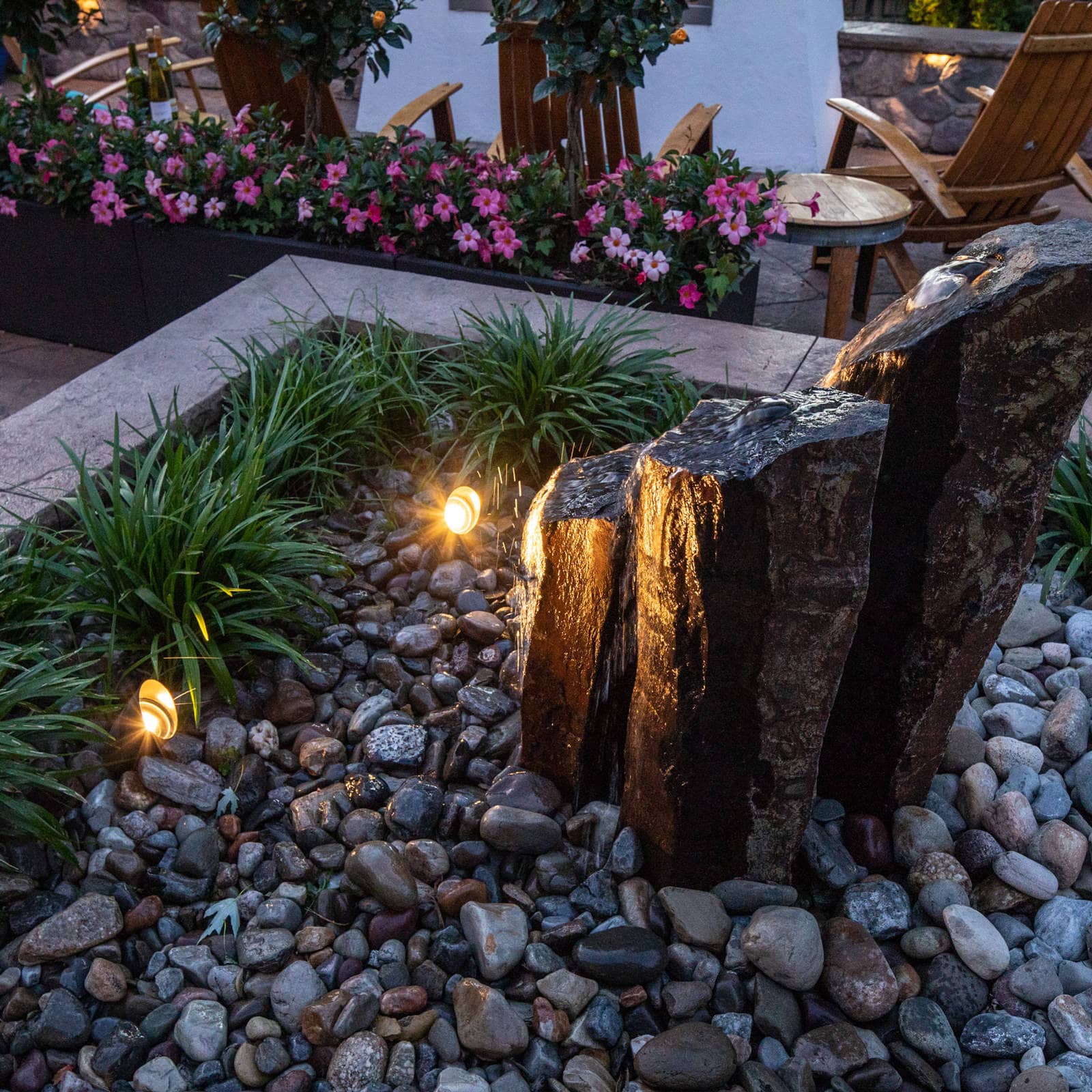
Beautiful within the landscape and soothing to the soul, natural basalt stone spires make the perfect water feature to accent any outdoor living space!
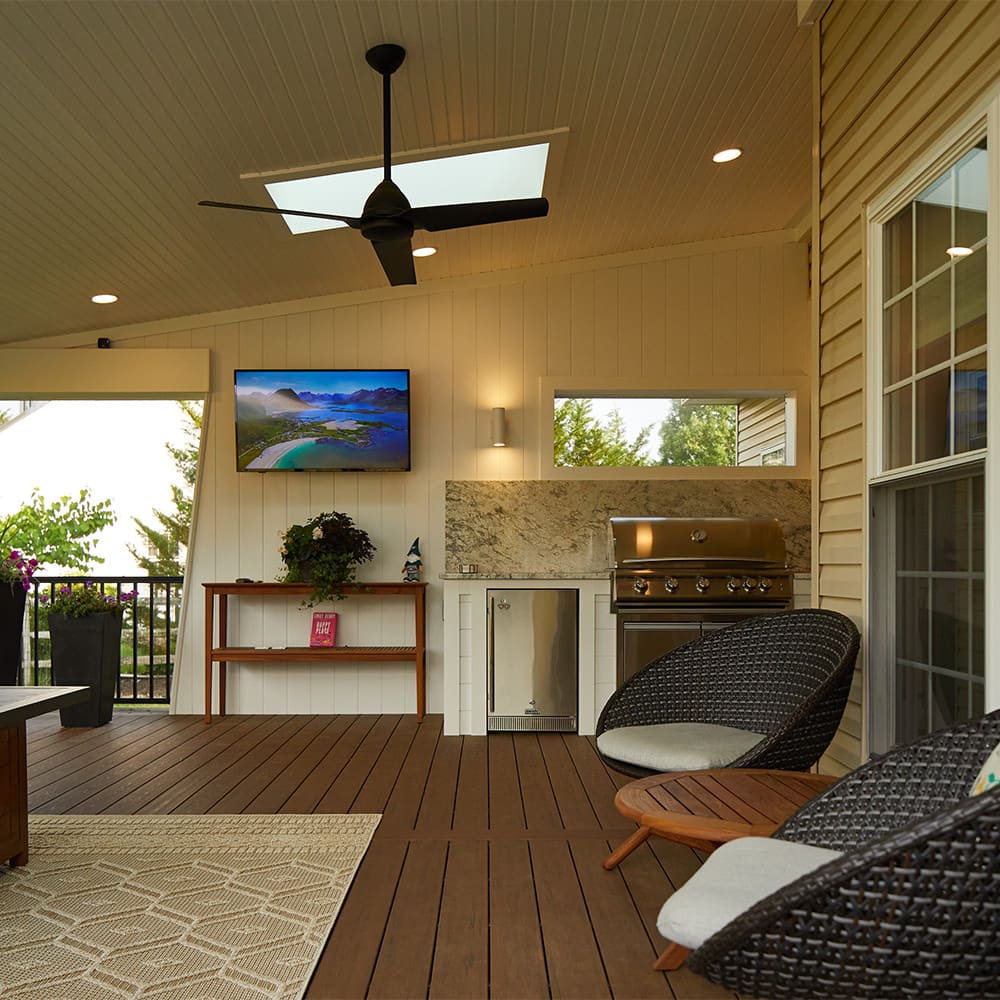
With careful design and planning, an outdoor living space can be beautiful and include several desired features without feeling cramped or overwhelming.
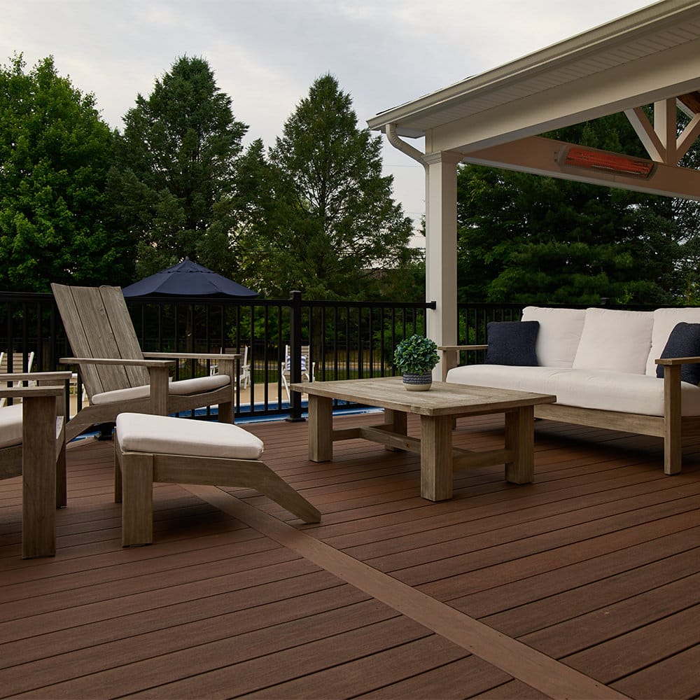
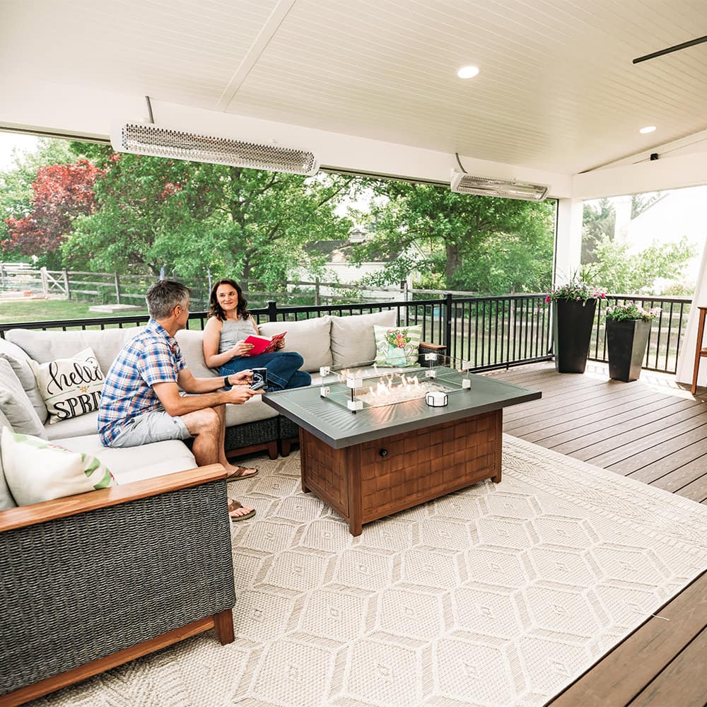
This open-air lounge space allows this family to relax under the stars and catch up on each other’s day. Pure bliss!
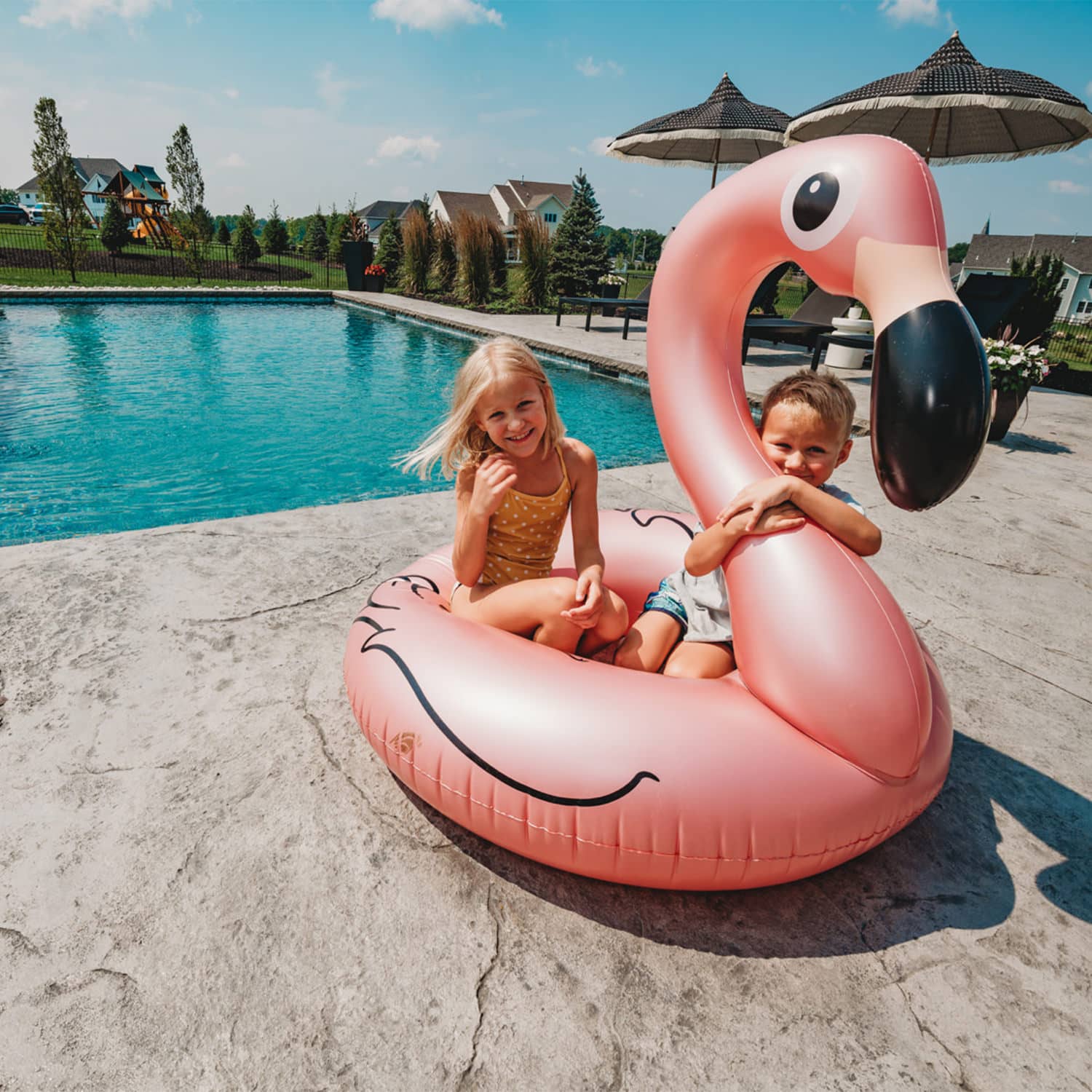
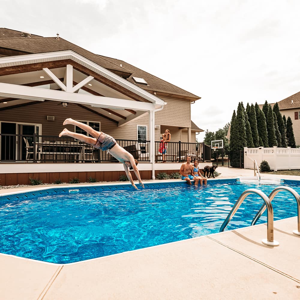
This Bethlehem outdoor living space is complete with a custom gunite pool and adjacent overflow spa which receives full sun in the summer...the kids can't wait to make a splash!!
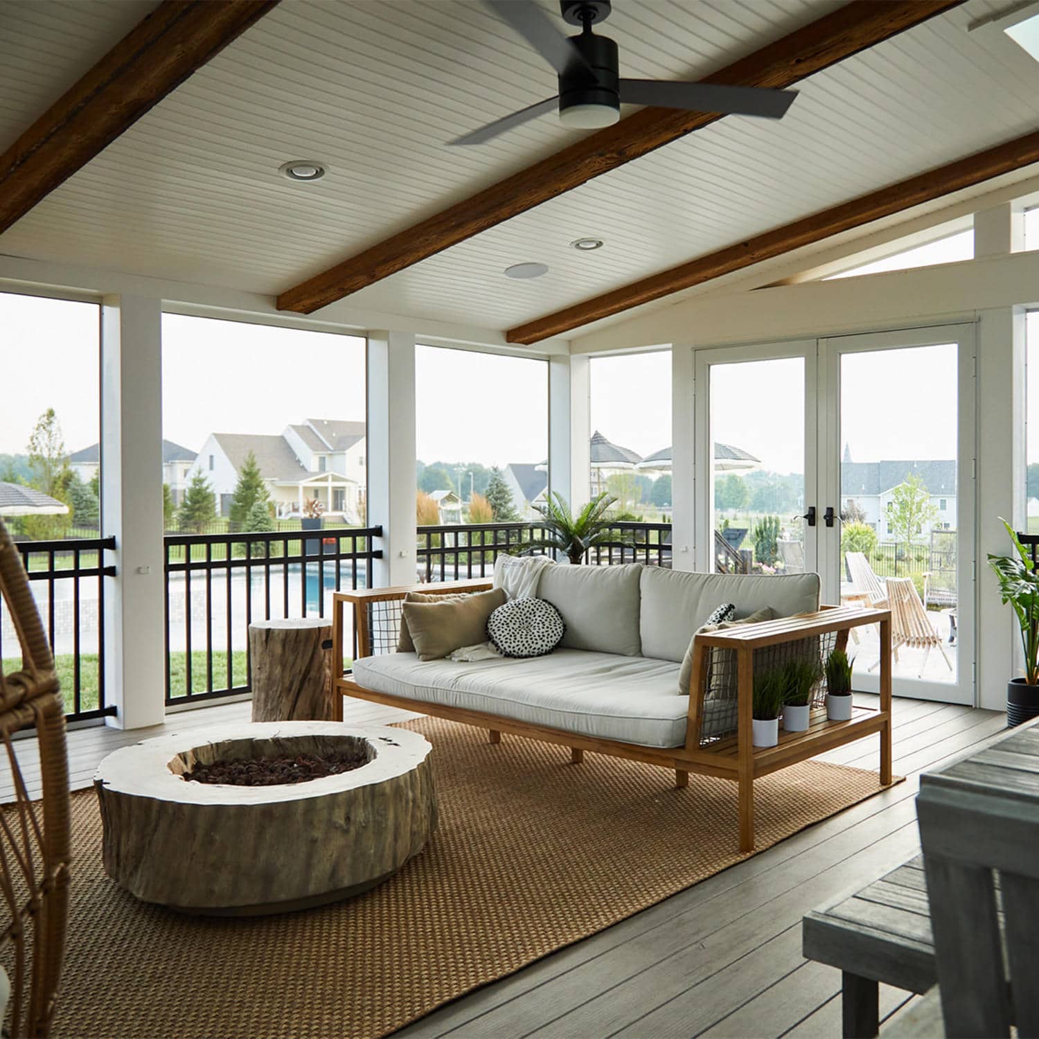
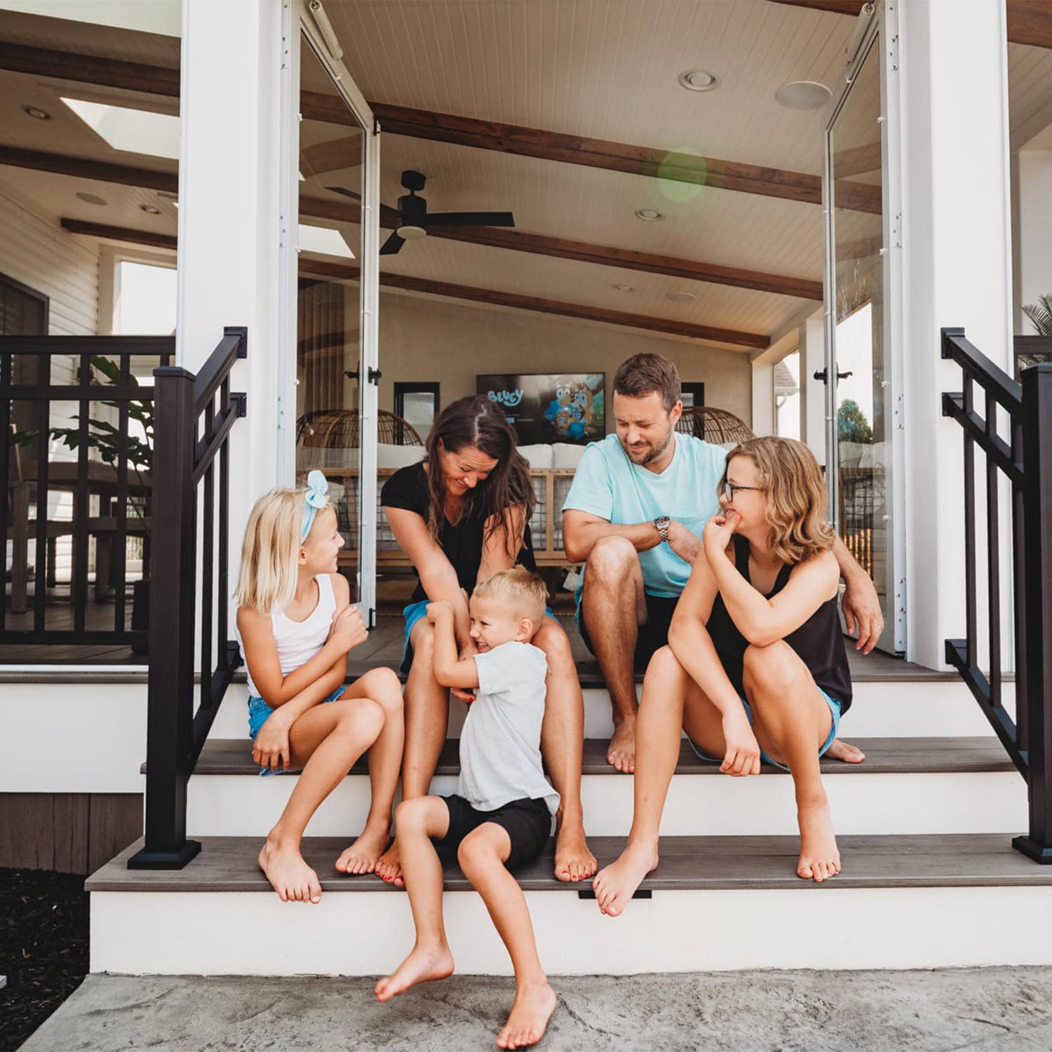
A seamless transition from inside the home to the outside deck is our standard. This eliminates obstacles and ensures easy travel for all members of your family!
Spend more time enjoying your outdoor living space than maintaining it in Schwenksville, PA. Every MasterPLAN project accounts for low-maintenance materials and high-level detail!
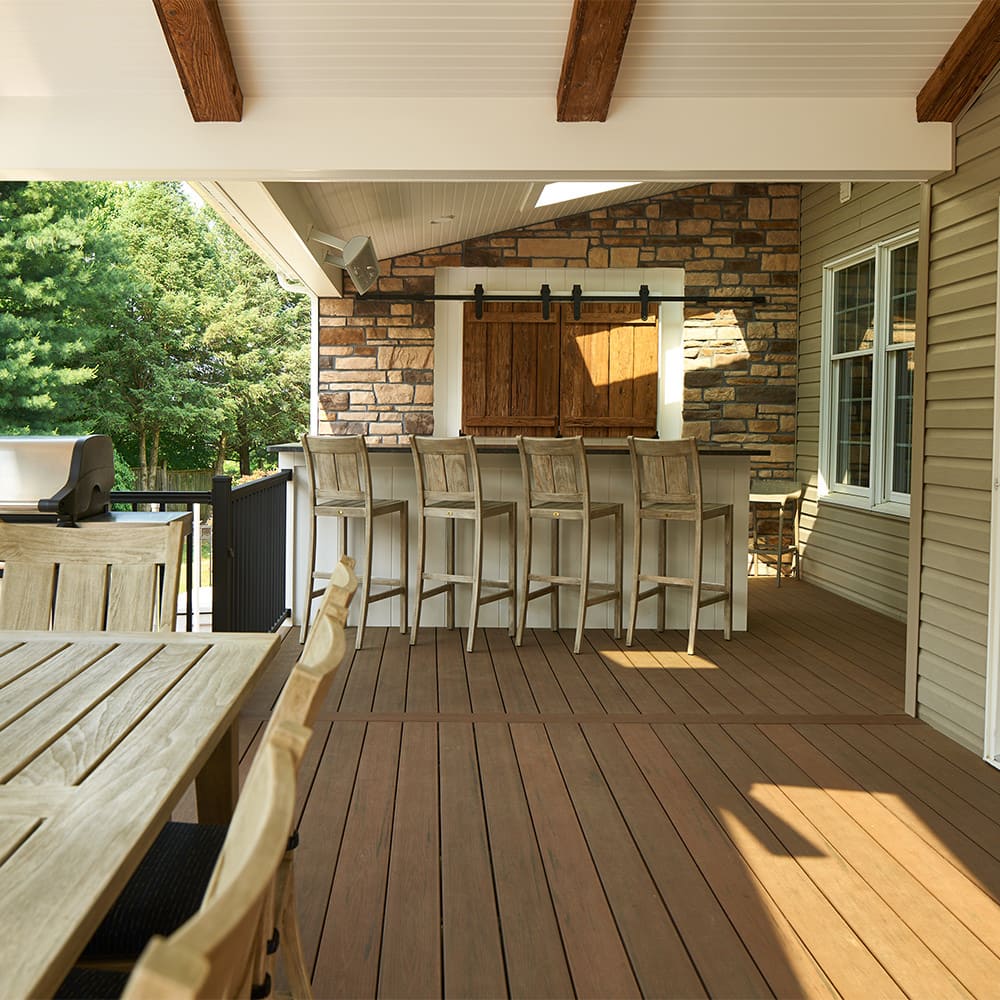
Our Furniture First Philosophy ensures your outdoor living space is sized appropriately, not too big or too small...just the right size for your furniture and your enjoyment!
This covered seamless transition deck allows you to be on a family vacation with the open swing of the french doors!
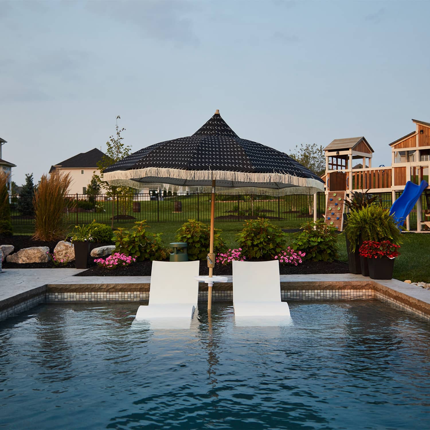
We incorporated a shallow sunshelf with in-pool loungers to this custom gunite swimming pool in Bethlehem so the adults could relax and catch some rays while keeping an eye on the little ones splashing and jumping!